A logo has a surprisingly difficult job. It has to be recognisable at a glance, work everywhere from a shop sign to a tiny social media icon, say something about your business, and still look right in ten years’ time.
So what makes a good logo? It’s rarely about following the latest design trend. It comes down to a handful of principles that the most effective logos, from global brands to the best local businesses, all share.
1. It’s Simple
The most memorable logos are usually the simplest. A clean shape and one or two colours are easier to recognise and remember than detailed illustrations or several fonts competing for attention. If you can’t sketch it from memory after seeing it once, it’s probably too complicated.
2. It Works at Every Size
Your logo will appear on a large shopfront sign and as a tiny icon in a browser tab. A good logo stays clear and recognisable at both extremes. Fine lines, small text and intricate details tend to disappear when shrunk down, which is why many brands have a simplified icon version alongside their main logo.
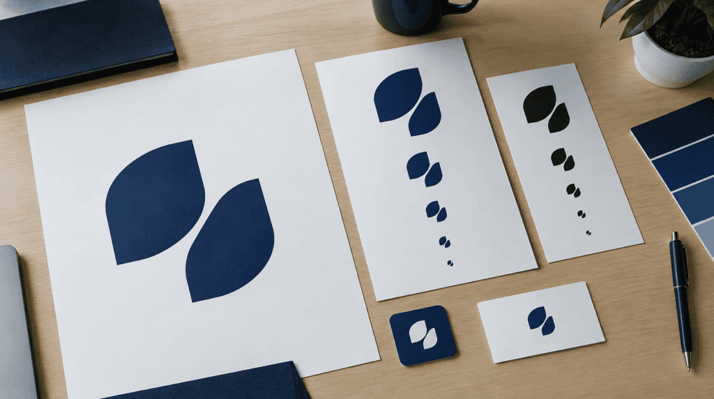
3. It Works in One Colour
Try your logo in plain black and plain white. If it still works, it’s strong. If it relies entirely on colour or gradients to make sense, it will struggle on receipts, embroidery, stamps, engraving and many other everyday uses.
4. It’s Distinctive
A logo should help people tell you apart from competitors. Look at the other businesses in your area and sector. If every local café uses a coffee cup icon, another coffee cup won’t help you stand out.
5. It Suits Your Business
Good logos feel right for the business they represent. A family-run trattoria, a law firm and a children’s tutoring service should look very different. The fonts, shapes and colours all send signals about price, personality and audience, so they need to match who you really are and who you want to attract.
6. It’s Built to Last
Trendy effects date quickly. The logos that last tend to avoid of-the-moment styles in favour of clean, well-balanced design. That doesn’t mean never updating it, as many brands refine their logos over time, but a strong foundation saves you from a full redesign every few years.
Good Logo Checklist
| Test | What to Check |
|---|---|
| Simplicity | Could someone sketch it from memory? |
| Scalability | Is it clear as a tiny social media icon? |
| One colour | Does it work in plain black and white? |
| Distinctiveness | Does it look different from local competitors? |
| Fit | Does it suit your price point and personality? |
| Longevity | Will it still look right in five to ten years? |
Lessons From Small-Business Rebrands
When we help small businesses rebrand, a few patterns come up again and again:
- Too much detail. Older logos often try to show everything the business does. Simplifying almost always improves recognition.
- Unreadable at small sizes. Many logos were designed for a sign or letterhead, long before social media profile pictures existed.
- No variations. Businesses often have only one version of their logo, which forces awkward compromises on different backgrounds and formats.
- Keeping what customers love. The best updates often keep a familiar colour, shape or name style, so loyal customers still recognise the business.
A Logo Is Only the Start
A great logo works best as part of a complete identity: colours, fonts, imagery and tone of voice that all feel like the same business. Our guide on what a complete brand identity includes explains how the pieces fit together, and if you’re wondering whether it’s time for a change, see when to rebrand and when to refresh.
At OxD PR, we design logos and complete brand identities for businesses across London, built to work everywhere from shopfronts to social media. Explore our branding services or book a free consultation.